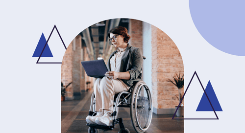
Accessibility is a core value for myself, my team, and Watermark as a whole. Our design system, Ripple, hosts a set of centralized standards and components for creating usable, accessible, and scalable products. But as the Head of Product Design, I know there is more to the story. I wanted to hear directly from Watermarkers to learn more about what our team is doing every day to ensure the accessibility of our solutions.
I sat down with Martin Maugeais, Lead Front End Developer & Accessibility Specialist, to discuss. I also spoke with Watermark’s Director of Accessibility, Srinivasu Chakravarthula; Senior Product Designer, Jess Warren; and Front-End Architect, André Mattis (pictured below, clockwise from upper left). Read on to see their answers to my questions and learn more about how we approach accessibility here at Watermark.

What does accessibility mean to you?
MM: I think of accessibility as a modality of inclusion. The web is a wonderful technology for its potential to be inclusive. It can be parsed in many different ways, so virtually anyone can access it. Previous technologies were limited by their medium. For example, a sound recording is not accessible to a deaf person, a staircase is not accessible to a wheelchair user, a paper book is not accessible to a non-sighted user. But the web can be accessed in many different ways, some of which are yet to be invented. That is an awesome promise, but it can only work if we web developers keep that flexibility in mind. Too often, we code with specific usage in mind: for a specific browser, for a specific input device… Making sure it works in our browser of choice is not enough. It fails many users. Accessibility requires taking into account the needs of various types of users, and that serves the greater goal of an inclusive web. Inclusion is vague, more like a declaration of intention: stating that we should all have equal access. Accessibility is a fundamental aspect for realizing this goal.
SC: Accessibility makes things easier for some, but makes things possible for many. Accessibility has empowered people with disabilities to gain access to education, employment, entertainment, travel, and everything else. As an accessibility professional, I get immense satisfaction from the work I do, which results in enabling everyone to use our solutions.
What are some of the challenges in building an accessible design system for multiple products with different needs?
MM: The main challenge is to get everyone involved. At the end of the day, a design system is just a recommendation: “Here’s how you should do this,” “Here’s how we do that at Watermark.” We publish a component library, a CSS library, and guidelines, but each product team is responsible for their product. We can polish our design system all we want, it will only succeed if it is adopted and used properly. If the developers who use the design system didn’t understand accessibility, they would misuse the components and misunderstand the guidelines, so it’s very important to get everyone on board. Watermark understands this: every developer at the company receives thorough accessibility training.
AM: Another challenge, and to some degree a different aspect of getting everyone on board, is ensuring that the design system handles all the use cases in each product in the best way possible. Sometimes that’s easy since a product’s particular workflow is not accessible for one reason or another. Most times, however, it requires creating variations that allow for different use cases that are still accessible in any combination.
One of the key parts of the design system is its components, the reusable building blocks for developers using Ripple. How do you ensure these are accessible?
MM: We look at what the W3C, the main organization authoring standards for the web, has written on the subject, and we follow these recommendations scrupulously. They are very formal declarative statements, a bit like a text of law. For instance: “The button has an accessible label.” This makes it easy to take each statement and turn it into a test, and gives us confidence our code is compliant and will remain so when we update it – the test will fail if we accidentally break an accessibility feature. We also look at a lot of other component libraries and take inspiration from them. Sometimes though, the W3C is silent, and the examples we find do not meet the conformance criteria. In these instances, we have to rely on our expertise to come up with our own accessible solution. That’s one of my favorite parts of the job.
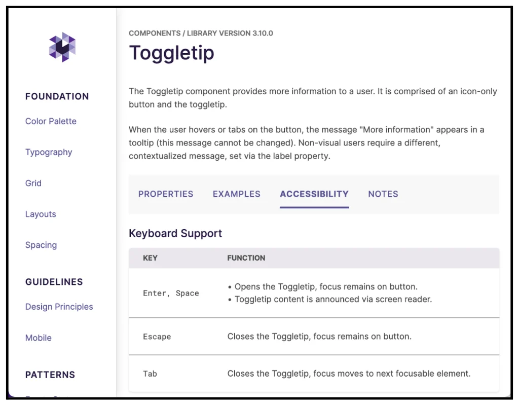
An example of accessibility documentation for the Toggletip reusable component, outlining the pattern’s functionality for keyboard users.
We recently launched a solution for Student Learning & Licensure that is considered somewhat of an accessibility innovation. Can you tell us about how that came to be?
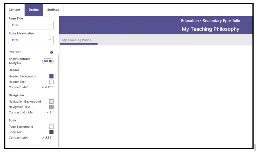
JW: The Student Learning & Licensure design, product, and engineering teams worked together to add the ability to measure color contrast as a part of styling ePortfolios. First, it was important to educate our users about color contrast accessibility, which we do through a toggle tip blurb with information like the definition, reasoning, and ideal color ratios.
Next, we wanted to empower our users to make their own ePortfolio styles accessible, which considers the needs of the end viewer of the ePortfolio. So we created a way to designate which color combinations meet color contrast requirements and which do not. I worked closely with our product manager and engineers to design and build this feature as an addition to the color picker.
To do this, we first paired elements such as a section’s text color and background color. When comparing those two colors, our system can tell if the combination meets contrast requirements. The feature shows a thorough result with a color-coded icon, clarifying text, and even the color contrast ratio itself.
Since this feature is aligned with the actual color picker – which is fully accessible to use – we have created an end-to-end accessible experience: from choosing the colors to the chosen colors themselves.
How has Watermark evolved its accessibility practice over the last few years?
MM: The most significant change was the addition in 2019 of the Director of Accessibility Program role, created for Srinivasu (Vasu) Chakravarthula. Prior to that, Watermark was already taking accessibility seriously, putting it as a central concern for the design system team, training employees… but there was no coordinated effort across the company. Vasu has not only been focused on ensuring our products are accessible, but he has created the training program I mentioned, he brings awareness to the issues faced by people with disabilities, and of course answers the many, many questions we have for him! It made Watermark’s commitment to accessibility much more tangible.
Anything other thoughts you’d like to share?
SC: Our accessibility efforts have evolved to a great extent. We were able to transform the thinking of our teams, integrate accessibility as part of the product development cycle, empower client-facing teams to empathize for accessibility, we’re able to evangelize about accessibility company-wide, and have supported a few community initiatives such as Knowbility’s Accessibility Internet Rally and Accessing Higher Ground conference.
Thank you all for your contributions to Watermark’s accessibility practice.
To learn more about Ripple, Watermark’s Design System, check it out at ripple.watermarkinsights.com.